How to Use Webinars to Sell Your Course Online

Here's what we have for you today
How to be an overnight rockstar (like you aren’t already!)

What I love:
- Great use of space. This page has a lot of content, but it doesn’t feel like it. Using vh100%, Susie uses space to draw attention to the key points.
- Great use of bold to highlight keywords and phrases. Bold makes the content easy to scan and helps the reader understand the key points.
- The subhead gives you everything you need to know about the webinar. The “attract new clients” part is hugely important, as it describes the transformation that having these new skills will help you achieve.
What I’d test:
- I’m allergic to “skyrocket.” It is overused and, in my mind, lazy, especially in the age of turgent AI copywriting.
- The CTA button is lost on the page. I would make it bigger and brighter. To do this, “Overnight Rockstar” could be reduced by 30%.
- The header banner is the most valuable area of an opt-in page. Everyone sees it and reads it. There is a lot of wasted real estate there at the moment. I would expand on FREE WORKSHOP to include some of the benefits of attending.
LEADS – Opt-in Page Swipe Files:
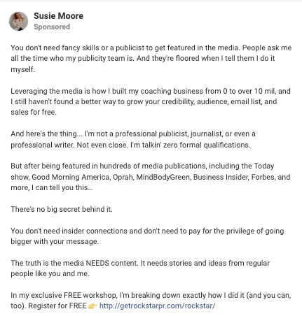
A counterintuitive open hook that provides instant audience positioning
What I love:
- Counterintuitive Opening Hook – Going against the grain is a great way to grab attention
- Audience Positioning – Within the first 14 words, someone knows if they are in the right place or not. Want to be featured in the media? Well, read on.
- Inferred Authority – People ask me all the time who my publicity team is. This is inferring that Susie gets lots of media attention and you should pay attention to her.
What I’d test:
- Susie has lot’s of ad copy variations in the ad library but they all use the same ad copy. Even if you have found your unbeatable ad you should always be testing. You never know whey your winning ad will keel over and die.
- I’d break up the text to make it easier to read. Aim for one line of text max, and never go over two. Single lines make it easier to read.
- The image above is only ⅓ of the ad. I’d test shorter ads formats as it give Meta an opportunity to follow up and show people a variety of ads. Remember, not everyone is ready to register straight away.
UPLEVEL ADS – Ad Swipe Files:
Price anchoring an evergreen offer to drive sales
If you are launching an evergreen webinar, a question that will quickly come up is:
Should I promote the offer I’m selling through my evergreen funnel on my website?
The answer is yes, but the level of detail on your sales page depends.
Susie uses one of my favorite approaches.
She uses her always-available sales page to price anchor her evergreen offer.
People aren’t stupid.
When you make them an evergreen offer, they will do their research.
This means you can make them feel like the evergreen offer is a steal.
In this case, Susie has her course listed on her website for $2,997.

However, when you go through her webinar funnel, you can buy it for $497.
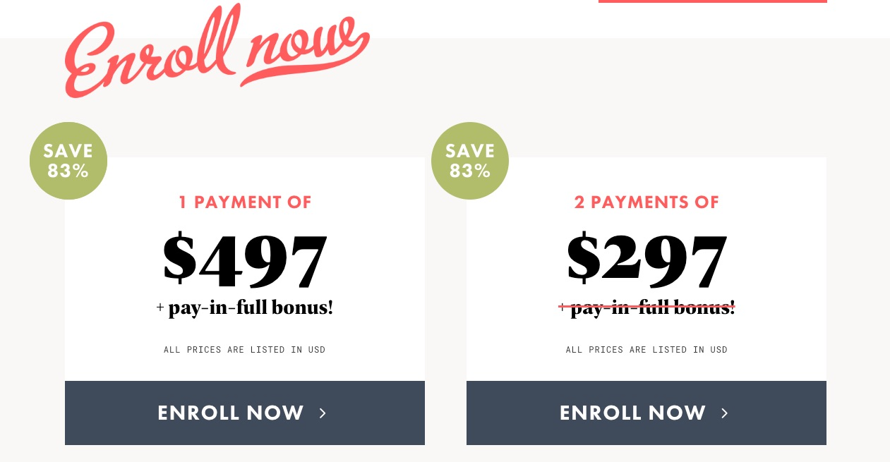
This will result in a massive conversion bump for your evergreen funnel.
Of course, you can still sell your full-priced course during your live launches.
The price difference is normally justified by an element of live coaching which isn’t offered on Evergreen.
NOW LAUNCHING – Offer Page Swipe Files:

