Responsive Webinar Funnel Optimization for Your Next Launch

Responsive Webinar Funnel Optimization for Your Next Launch

Responsive Webinar Funnel Optimization for Your Next Launch

Discover key strategies to optimize your webinar funnel, and maximize engagement with expert tips and techniques tailored for success.
Responsive Webinar Funnel Optimization for Your Next Launch

Here's what we have for you today

blank

Webinar Registration Page Design

Mobile Optimization

Up to 80% of visitors to your opt-in pages will be on mobile.


If you want to succeed online today, you’ve gotta think mobile first. 


I’ve been banging on about this for years.


But this is the first time I’ve seen a double hero.


When I landed on Jenna’s (desktop) opt-in page, my first thought was… boy this is cluttered.


It wasn’t until I switched to mobile view that I saw the genius of what she had done.
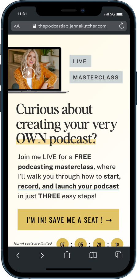
Mobile Optimization

The top banner of the desktop page becomes the mobile above the fold section complete with.

  • Headline
  • Body Copy
  • CTA
  • Image
  • Scarcity (Countdown timer)


And then when the visitor scrolls, they have a second hero section.


One thing that stands out when looking at the desktop version is how little space you have on mobile.


Looks like we all better get good at saying a lot with as few words as possible!


Opt-in Page Swipe Files


Persuasive Facebook Ad Journey to a Free Webinar

Persuasive Facebook Ad

Is launching a successful Podcast as easy as 3 Simple Steps?


No, of course, it isn’t, but if most people knew how hard it was, they would never try.


Is Jenna a “bad person” for painting a podcast launch much easier than it is?


No. Not at all. She knows how powerful a podcast can be in driving online business growth.


Her job is to convince as many people as possible to launch a podcast so they can have the same growth she has.


And how do you do that? You make it seem effortless.


You break it down into simple steps and give people what they want: a silver bullet.


Her job is to get people to take just one step. 


One step forward toward their ultimate goal. One step into Jenna’s world.


Because once they are in Jenna’s world, she can help them take the next step.


Create a framework, give people simple steps, and show them the shortcut.


To get them to take their first step, make it feel effortless and guarantee their success.


 Facebook Ads Swipe File


Offer page template for your next launch

offer page template

Speaking of keeping things simple.


Here is an offer page hero template for your next launch. 


Introducing Your Complete A-Z {Your Topic} Roadmap


Get my proven, 5-step stress-busting system to {primary outcome} in just 30 days.


I love the phrase “5-step stress-busting” so much alliteration and consonance.


 Sales Page Swipe Files


Optimizing Webinar Funnels for Maximum Conversions

Optimizing Webinar Funnels for Maximum Conversions

Optimizing Webinar Funnels for Maximum Conversions

Unlock the secrets to maximizing conversions in your webinar funnels with expert optimization strategies for course creators.
Optimizing Webinar Funnels for Maximum Conversions

Here's what we have for you today

blank

The “How I (Achieved Primary Promise)” Headline

Hate him or love him. (and you probably hate him!) Grant Cardone is one of the world’s top marketers.


His marketing style is brash and loud with private jets and lambos.


This isn’t our cup of tea. And if you’re reading L.A.U.N.C.H., it probably isn’t yours.


But that doesn’t mean we can’t learn from Grant.


In fact, some of the best lessons we can learn are from people at the polar opposite of our marketing style.


What I love about Grant is he knows his audience. 


Every campaign, promise, word, and image he delivers is fully aligned with the audience he serves.

Webinar opt-in page optimization

Before we get into the review can we just stand back and applaud the social proof.


“Grant Cardone – Certified Billionaire”


Firstly, I am pretty sure there is no Billionaire certification program. 


(Not that it isn’t something I’ve had to research just yet!)


But it takes a certain type of person to put this on an opt-in page. Bravo, Grant 👏👏👏👏 


OK, back into the opt-in page structure and what we can learn and implement in our own funnels.


There are two versions of this headline


  1. “How I did X” 
  2. “How Student Z did X”


Both of these are powerful mechanisms.


In both cases, “X” is the primary desire of your audience. 


Primary desires need to be specific. In this case, it is earning $5,000,000.


But not just making $5,000,000. It’s making it in 90 days with 0 contacts and just $100.


Bounding your primary promise with a timeline for attainment will always increase the appeal.


The next two elements are key because they answer two primary objections.


“Well, of course, Grant can make $5,000,000 in 90 days, but I don’t have his network or his money.” 


Everyone who lands on our opt-in page has a number of objections.


If we don’t answer the most common objections there and then it will kill our conversion rate.


This mechanism can be equally powerful to demonstrate how you achieved your audience’s primary desire or how a student of yours has achieved the primary desire.


Remember, people need to believe 3 things before they buy from you:

  1. You have the skills and knowledge to help them achieve their primary desire
  2. You have a process that guarantees they can achieve their primary desire
  3. You are the person they want to lead them to their primary desire


Both of these style webinars or lead magnets can work exceptionally well to instill these 3 beliefs before making an offer.


The pre-header is also a common and highly effective mechanism you can implement on your next opt-in page:


FREE (Training, Guide, Plan, Cheatsheet) Reveals


Opt-in Page Swipe Files


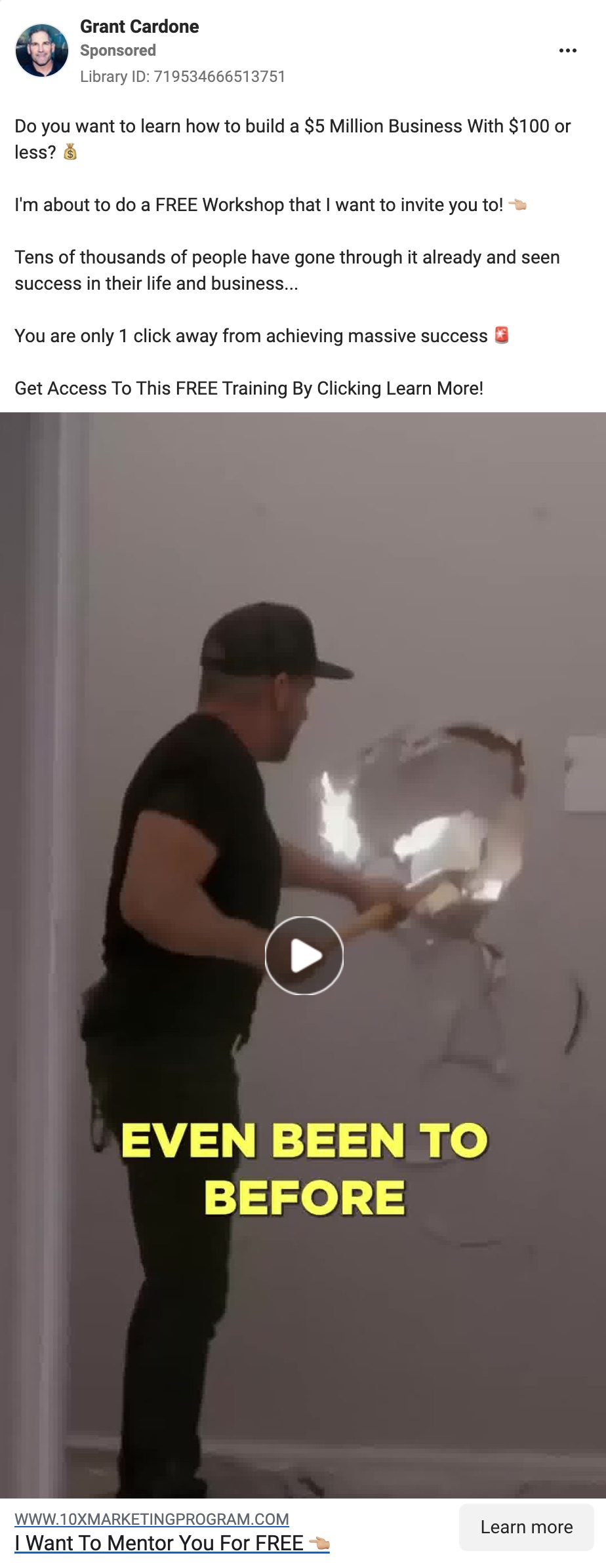
The very first Facebook ad I write for every new campaign

Facebook ads for course creators and membership site owners

When you crack your primary promise, the copy writes itself.

Everything that we discussed in the Leads section applies here.

Notice how closely the ad copy language mirrors the opt-in page copy.

The first ad I draft for a new opt-in campaign always uses the majority of the copy of the opt-in page with very little else added.

The feedback loop on Facebook is faster than your opt-in page.

If an ad containing your opt-in page copy flops, you know your opt-in page won’t convert, and you need to go back to the drawing board.

On the other hand, if the ad is getting good engagement on Facebook, you know you’ve got something to work with.  

Facebook Ads Swipe Files


The upside down sales page

Sales page optimization

Grant brings an energy and enthusiasm to his webinar that is hard to beat.


We may roll our eyes at his message and his brash style, but his audience loves him and hangs on every word he says.


He has an infectious confidence. 


He believes 110% in his own abilities and his ability to get you the result you want.


By the time the sales page link is shared at the end of the webinar, he knows there are people who are ready to buy.


And if you have people you know are ready to buy the last thing you should do is make them work to do so.


And that’s why I believe Grant’s upside-down sales page works.


When drafting a traditional sales page, we want to bring people on a journey.


On a journey from objection-filled, disinterested, skeptic to enthusiastic buyer.


On a traditional sales page, we map that journey as:

  1. Position
  2. Problem
  3. Pain
  4. Prescription
  5. Pivot
  6. Product
  7. Product Details
  8. Price
  9. Promotion
  10. Purchase Details  


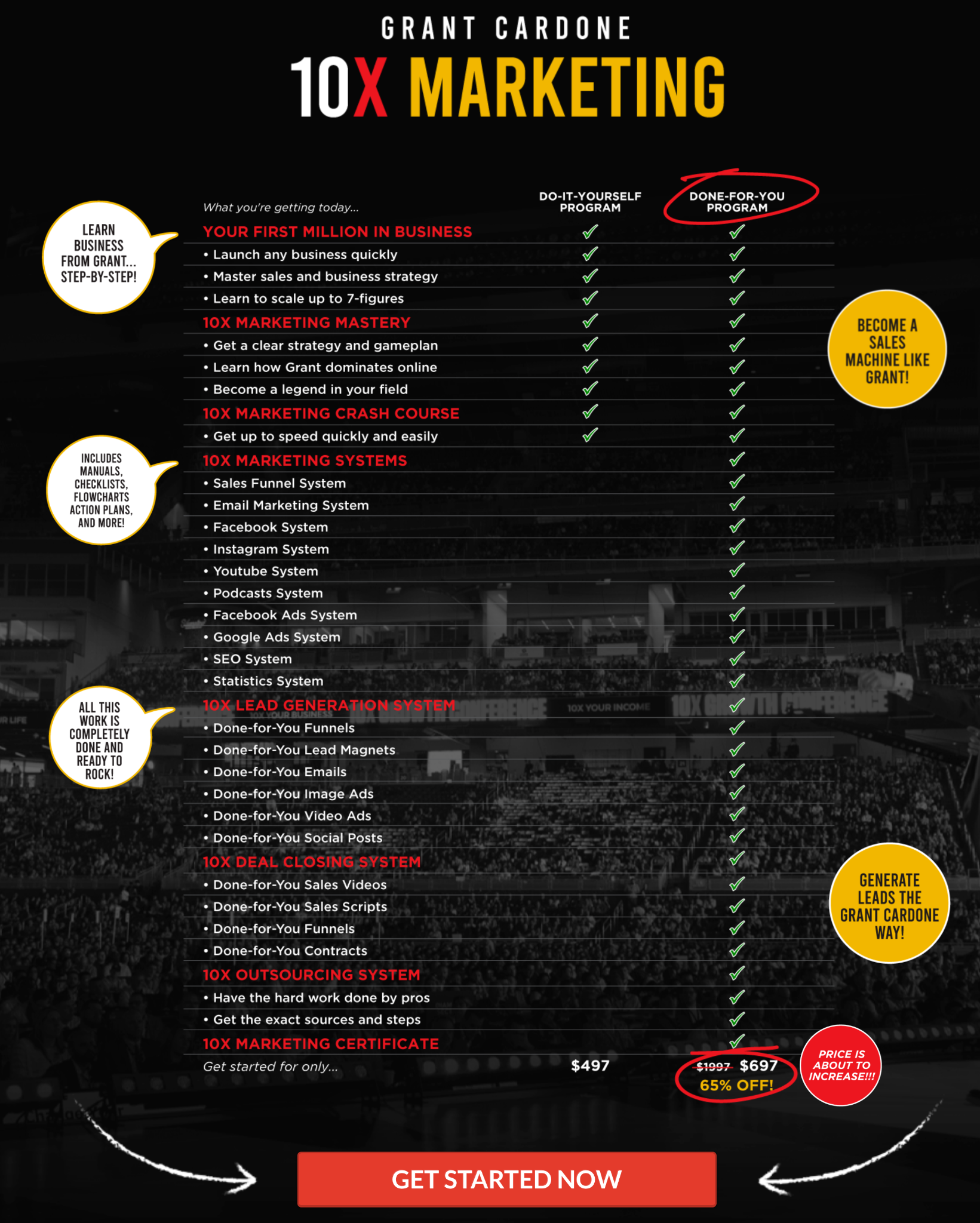
You can see here Product Details and Price are right at the bottom.


Grant flips the script on this, placing these two items at the very top of the page.


This would be disastrous if Grant were sending cold traffic to the sales page.


They would make their decision based on cost alone.


However, as he has whipped his audience into a frenzy during the webinar, it makes sense to put it front and center.


And remember, they have already seen the offer block and the price on the webinar.


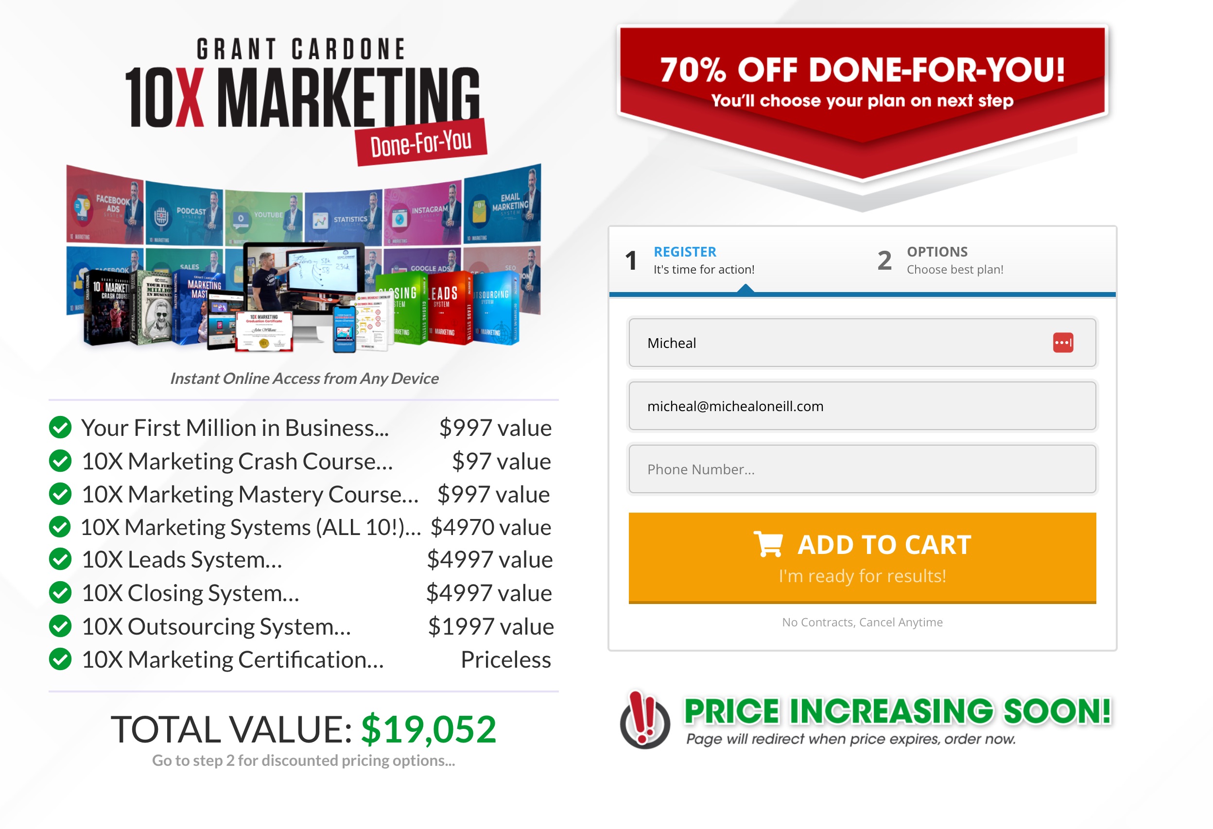
And look how he stacks the value further down the page in the pricing section:

Sales page optimization for online courses

Positioning the done-for-you option so close in pricing to the do-it-yourself option will push the majority of purchases to the higher price option.

We can achieve the opposite effect by making the done-for-you option $1,497.

In this case, $1,497 would provide a positive price anchor for $497 and make it seem even better value.

This is definitely a sales page to study in full for your next offer:

Sales Page Swipe Files

Unlock expert strategies and tactics to maximize your webinar effectiveness and drive revenue for your course offerings.

How to Use Webinars to Sell Your Course Online

How to Use Webinars to Sell Your Course Online

Unlock expert strategies and tactics to maximize your webinar effectiveness and drive revenue for your course or membership.
Unlock expert strategies and tactics to maximize your webinar effectiveness and drive revenue for your course offerings.

Here's what we have for you today

blank

How to be an overnight rockstar (like you aren’t already!)

blank

What I love:


  • Great use of space. This page has a lot of content, but it doesn’t feel like it. Using vh100%, Susie uses space to draw attention to the key points.
  • Great use of bold to highlight keywords and phrases. Bold makes the content easy to scan and helps the reader understand the key points. 
  • The subhead gives you everything you need to know about the webinar. The “attract new clients” part is hugely important, as it describes the transformation that having these new skills will help you achieve.


What I’d test:

  • I’m allergic to “skyrocket.” It is overused and, in my mind, lazy, especially in the age of turgent AI copywriting. 
  • The CTA button is lost on the page. I would make it bigger and brighter. To do this, “Overnight Rockstar” could be reduced by 30%. 
  • The header banner is the most valuable area of an opt-in page. Everyone sees it and reads it. There is a lot of wasted real estate there at the moment. I would expand on FREE WORKSHOP to include some of the benefits of attending.


LEADS – Opt-in Page Swipe Files:


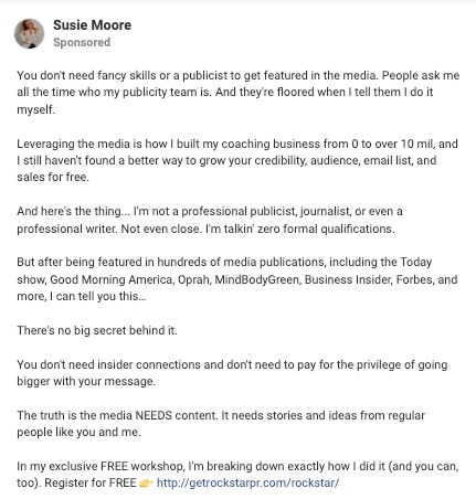
A counterintuitive open hook that provides instant audience positioning

blank

What I love:

  • Counterintuitive Opening Hook – Going against the grain is a great way to grab attention
  • Audience Positioning – Within the first 14 words, someone knows if they are in the right place or not. Want to be featured in the media? Well, read on.
  • Inferred Authority – People ask me all the time who my publicity team is. This is inferring that Susie gets lots of media attention and you should pay attention to her.


What I’d test:

  • Susie has lot’s of ad copy variations in the ad library but they all use the same ad copy. Even if you have found your unbeatable ad you should always be testing. You never know whey your winning ad will keel over and die.
  • I’d break up the text to make it easier to read. Aim for one line of text max, and never go over two. Single lines make it easier to read.
  • The image above is only ⅓ of the ad. I’d test shorter ads formats as it give Meta an opportunity to follow up and show people a variety of ads. Remember, not everyone is ready to register straight away. 


UPLEVEL ADS – Ad Swipe Files:


Price anchoring an evergreen offer to drive sales

If you are launching an evergreen webinar, a question that will quickly come up is:

Should I promote the offer I’m selling through my evergreen funnel on my website?

The answer is yes, but the level of detail on your sales page depends.

Susie uses one of my favorite approaches.

She uses her always-available sales page to price anchor her evergreen offer.

People aren’t stupid. 

When you make them an evergreen offer, they will do their research.

This means you can make them feel like the evergreen offer is a steal.

In this case, Susie has her course listed on her website for $2,997.

blank

However, when you go through her webinar funnel, you can buy it for $497.

blank

This will result in a massive conversion bump for your evergreen funnel.


Of course, you can still sell your full-priced course during your live launches.


The price difference is normally justified by an element of live coaching which isn’t offered on Evergreen.


NOW LAUNCHING – Offer Page Swipe Files:


0083-s2-colin-boyd-mini-offer

A Simple But Effective Sales Page Format

A Simple But Effective Sales Page Format

So, let’s take a look at Colin’s offer.

Structurally, this is a very simple sales page built in Clickfunnels.


Colin’s 13-minute VSL does most of the heavy lifting when it comes to the sale.


It’s a $47 offer with a $27 offer bump and a $297 one-time offer.

0083-s2-colin-boyd-mini-offer

The primary promise is clear:  


How to sell people into your programs using your conversion story.


He uses the [Primary Promise] without [Primary Frustration] headline format.


Colin also shows that you don’t need to worry about long headlines. 


At 29 words in the primary headline and 10 in the sub-headline this is a mouthfull


Colin relies heavily on social proof from a lot of the “big” names in the online world.


The offer page is short (or comparably short to a lot of the pages we review).


But I like it. Even in its shortened form, it ticks all the boxes.


  • Connect
  • Problem
  • Solution
  • Your Solution
  • Bonuses
  • Transformation
  • Objections
  • Price reveal
  • FAQ’s


The only thing I don’t see is a guarantee, which is unusual but perfectly acceptable with a low-ticket offer.


UPLEVEL ADS – Ad Swipe Files: