Crafting Effective Launch Opt-In Pages with an Upsell
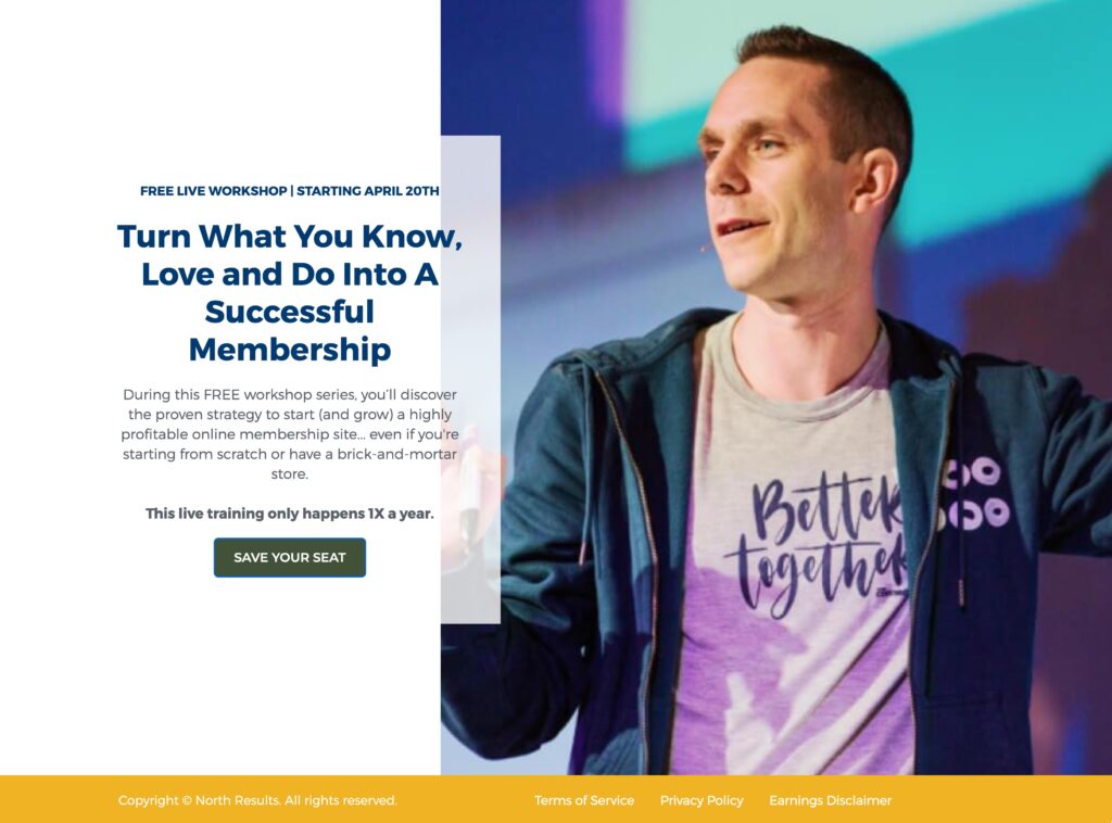
TME Launch Opt-in Page
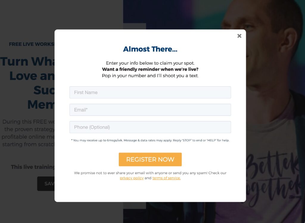
TME Launch Opt-in Page Pop-up
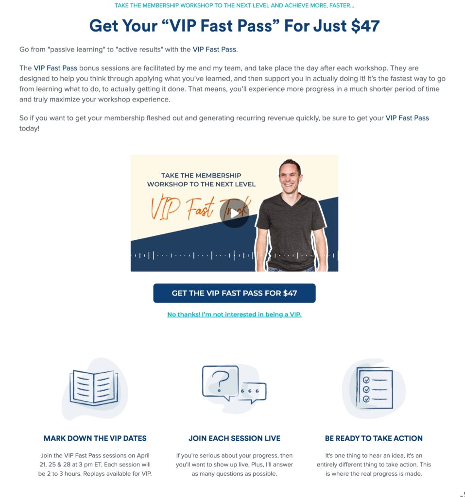
TME Launch Opt-in VIP Upsell
3 Elements To Inspire Your Landing Pages:
- TME Launch Opt-in Page – Single page, everything above the fold, opt-in page here for Stu. If it’s good enough for Stu with a launch he will be hoping will bring in over $5mill, it can work for your launch. Brilliant use of scarcity and deadline – This live training only happens 1X a year. Notice FREE Workshop. Despite being a multi day training only the first date is mentioned. This keeps it simple and doesn’t drive people into overwhelm.
- TME Launch Opt-in Pop-up – Notice the inclusion of the phone number. Text message marketing is extremely powerful. Yes, there is a cost associated, but with Twillio’s low rates and high text message engagement rates, you will get a positive ROI.
- TME Launch Opt-in VIP Upsell – An upsell is powerful from several perspectives. 1) it gives you an opportunity to scale your ad spend. At $47, it is somewhat realistic for Stu to break even on the costs of ads for his launch. This gives him massive confidence to scale his ad spend. 2) People who purchase a VIP package will be more like to engage with the launch. People who are more engaged will be more likely to buy. 3) The psychological principle of consistency means that people who have already paid an amount earlier in the process will be more likely to feel internally compelled to purchase when the primary offer is made for TME.
3 Elements We’d Test:
- Paid launches are steadily rising in popularity. Those who have tested the model have seen far a far lower number of people partaking in their launch but get a far higher conversion rate during the launch and are reporting higher launch revenue. People have become used to opt-in for launches and then not taking part. It is a big scary test but one I would love to see on a launch of this scale.
- I always test the text on the left and right sides of the page. There are two entrenched schools of thought on this. 1) your eyes always end up on the right side of the page, and this is where you should place the text. 2) your eyes scan the top of the page, hit the right side, and then travel diagonally from the top right-hand corner to the middle right in a Z pattern. Therefore your should place your headline along the top and your important text on the right side of the page. I have tested both and don’t have conclusive evidence for one approach or the other. I have seen switching sides, either way, result in a big jump in conversions, so it is always worth testing.
- Getting a phone number is a good idea, but I would like to know how much it hurts the overall conversion rates. I would run 3 tests over a limited period of time: 1) no phone number collected 2) phone number on the secondary screen after opt-in 3) Phone number not optional. The real test is the impact on purchases for The Membership Experience. As a result, we want the opt-in sample sizes to be around the same size and be able to calculate the total spent per test.

