Analyzing a Successful 3-Part Pre-Launch Strategy
So onto Jeff’s launch strategy. Jeff is running a 3-Part Challenge as a pre-launch for PLF Live.
At PLF Live, Jeff will offer Launch Club.
This makes Countdown to Launch a pre-launch for the pre-launch of Launch Club.
The structure is as follows:
(JV, FB Ads, Email) > Countdown to Launch Opt-in > VIP Upsell ($47) > PLF Live ($397) > Launch Club ($12,000)
3 day live events are the #1 way to sell high-ticket programs. Since COVID forced people to move there events online, people across the board are seeing significant decreases in event costs, increases in events registrations and high conversion rates to their in event offers.
The three primary methodologies for launching a virtual live event are webinar series, challenge or multi-part workshop.
Jeff is rolling out a multi-part workshop….but here is the interesting part. He isn’t just doing it once. He is delivering the workshop live and then rolling out a recorded version of it each week for 3 weeks up until PLF Live.
This gives plenty of opportunity for his JV partners to pick the most opportune time to email and his team time to scale their Facebook Ad campaigns.
Here is an above the fold screen shot of the opt-in page.
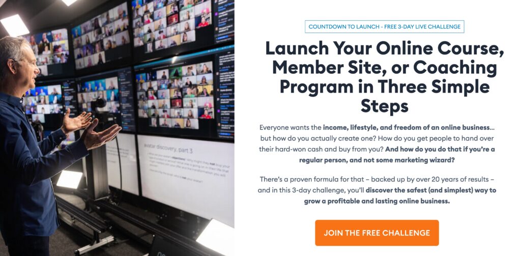
3 Elements To Inspire Your Opt-in Page:
- Follow the proven model: There are 5 key above-the-fold components of an opt-in page. Headline, Subhead/Prehead, Image, Body Copy, CTA. Not alone is Jeff following the proven model structurally. He is following it from a copy perspective too. Free is used twice (Prehead & CTA). Clear primary promise (Launch Your Online Course, Member Ste, or Coaching Program). Make it feel easy (3 simple steps). Then the body copy backs up your claims and provides evidence as to how people will achieve the primary promise of your headline. Deviate from this model, and you risk a much lower conversion rate.
- Make it easy: People are busy. They don’t read your copy. They scan it. I love how Jeff has highlighted key phrases and sentences using bold. This helps people take away 80% of the message in your copy at a glance without reading all the words. This is one of the reasons I love bullet points. Bullet points force you to say what you want to say concisely. They also draw the reader’s attention to the points and force them to slow down.
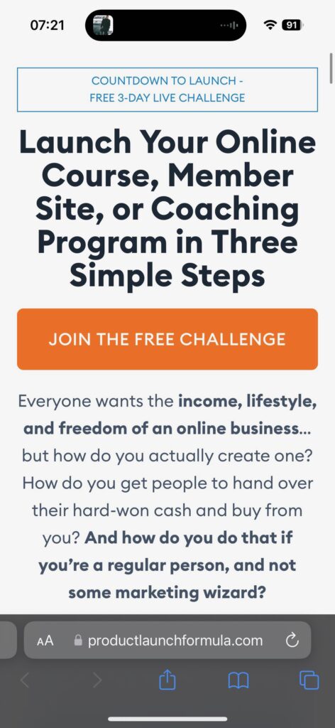
- Mobile optimization: Below is a screenshot of the mobile version of the opt-in page. If you are running ads 60%-80% of your traffic will come from mobile. If you’re driving email traffic, your mobile percentage might be a little lower, but it will still make up over 50%. Look how Jeff moves the opt-in button up directly below the headline to make sure it shows up above the fold. If you download the pdf of the mobile opt-in page you will also notice the image has moved to the very bottom of the above-the-fold section from the desktop version. There is nothing worse to arriving on a mobile opt-in page and being hit with an image that takes up 75% of your screen. Ain’t no one got time to be scrolling past images on their mobile!
Swipe:
- SWIPE FILE – 0042 – Jeff Walker – Launch Opt-in Page Desktop
- SWIPE FILE – 0042 – Jeff Walker – Launch Opt-in Page Mobile
- SWIPE FILE – 0042 – Jeff Walker – Launch Opt-in Registration Pop-Up
- SWIPE FILE – 0042 – Jeff Walker – Launch Opt-in VIP Upsell

