Mark Lack is launching his ShortenTheGap Program.
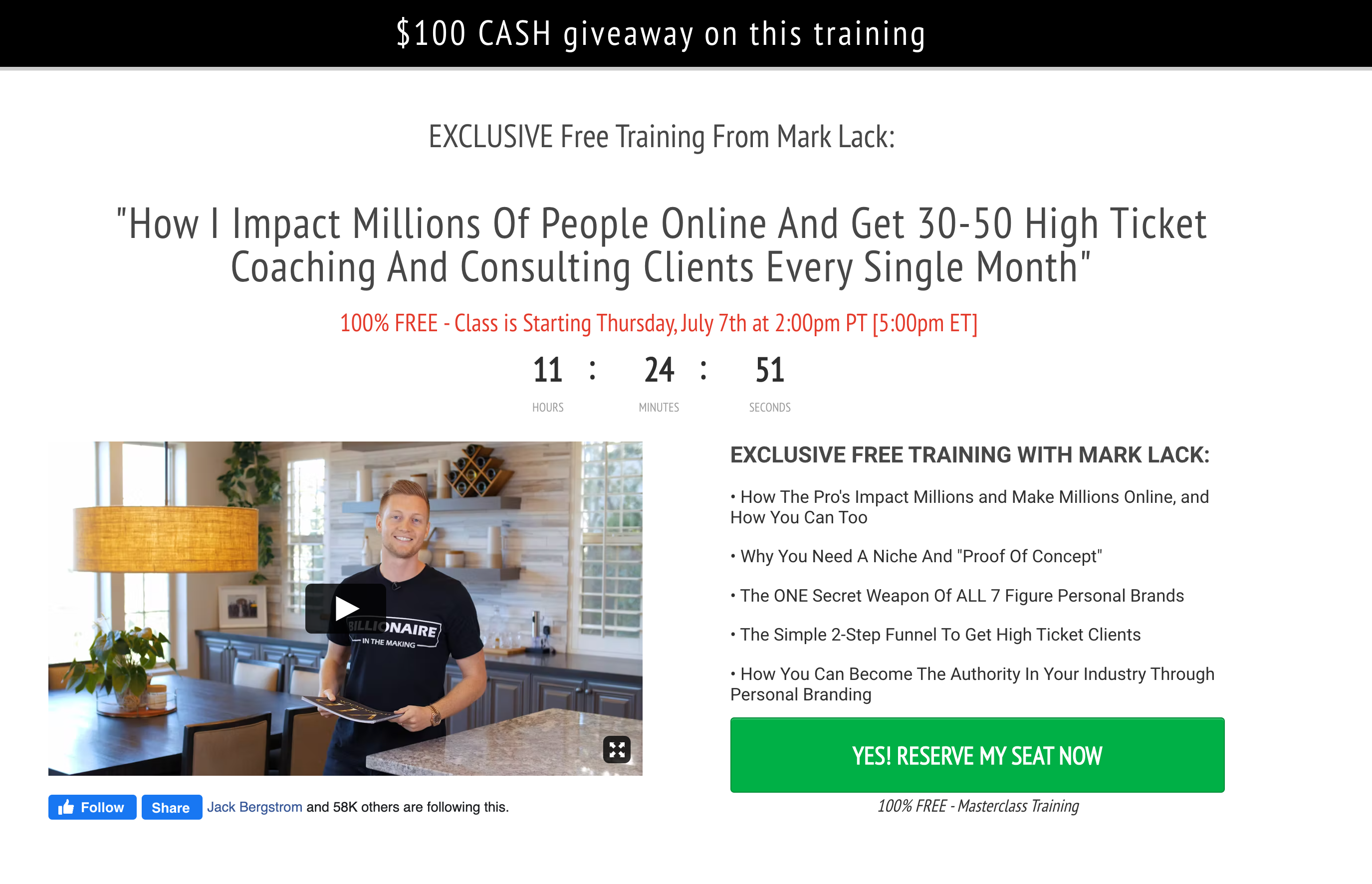
The screenshot is an above-the-fold view of the registration page for the launch webinar.
In the second half of the page (not shown above) Mark has gone for simple testimonials and a bio section.
I always encourage people to start with a simple single-screen opt-in.
Everything people need to register should be contained on a single screen.
Once you have optimized the above-the-fold section to a conversion rate above 50%, you can start testing testimonials and bio below the fold.
Some key takeaways:
- I love the top banner – $100 CASH giveaway on this training. $100 hardly seems worth my while, but I appreciate that you don’t want the incentive to be the only reason why someone registers and shows up. For Mark, I think that $1,000 is worth testing. For us, mere mortals, maybe a 1-on-1 strategy session or something of value that people can’t get free elsewhere.
- In a trend that we see over and over Mark stresses the FREE training twice on the page. Many people shy away from this as they don’t want to attract people who are only interested in free stuff but I think the evidence is clear that it increases conversion rates.
- It is interesting that Mark makes the headline about him and doesn’t flip it to “how you can”
- Impact millions is a little vague. This is definitely an area that could be strengthened. Yes, people want to believe that they are impact-driven. This is a powerful alternative to filling your pockets with cash.
- 30-50 clients per month is specific. However, I would also test a single number. One way to arrive at this number could be to add up all the clients attracted in a year and divide that number by 12 ((504/12) = 42). Saying how I attracted 42 clients per month is a stronger and more compelling proposition.
- Timers work a treat the closer it gets to the deadline. If you are 7 days away from a deadline a countdown time may work against you as people think, “oh I have plenty of time. I’ll come back and make that decision later”. Countdown timers are most effective from 72 hours to the deadline.
- Below the image, you will notice a section with the Facebook follow and share button. This is a simple piece of code that you can generate in the Meta for Developers portal and add to any page. There are a few reasons why I love this. First, if you have a large page, it is a great way of demonstrating social proof. Second, it makes it very easy for people to share. And thirdly, if you are friends with anyone who likes the page, their name will display in the widget. Seeing your friend’s name on an opt-in page will massively increase your likelihood of signing up.
C – Creator Central
Top Ranked Video Marketing Metrics
Psssst……. don’t tell anyone else…… but video marketing is kinda a big deal.
If you don’t have (or plan to have) video in your marketing mix, you are missing out.
Hubspot has released its 2022 Video Marketing Report. Hubspot surveyed over 500 video marketers to identify the latest trends and their future plans.
This Report is a must-read if you are utilizing video in your marketing.
One of the key sections of the report was the prioritization of video marketing metrics. Or, put another way, what are professional marketers optimizing their video marketing for?
60% of video marketers agreed that this was their most important metric.
Often we can get captivated by the number of views a video gets, but that only tells a fraction of the story.
Of far greater importance is how much of your video people consume.
And this is true whether it is long-form, short-form or even video ads.
Produce video content that grabs and holds people’s attention.
The 20% that will get you the 80% of your results is the very start of your video. (2-3 seconds short form and 5-10 seconds long form)
Hit them between the eyes and get the meat of what you have to say onto the table early in play.
That way, they will be far more likely to stick around.
Every video should have a Call To Action.
Top-of-funnel videos will have a soft call to action (like, subscribe, share).
Middle-of-funnel videos may ask people to opt-in or initiate contact.
Bottom of funnel videos will ask people to make a purchase.
Whatever your objective, you should have a success metric defined in advance.
Your conversion rate is the total number of people who viewed the video divided by the number of people who completed the CTA.
Before someone makes it to your CTA, they must first be compelled to engage.
Your thumbnail and title/caption are essential in driving this initial engagement.
Think of this as the opt-in copy for your lead magnet.
You could have the best lead magnet in the world, but if you can’t make a compelling case as to why people should opt-in, no one will ever see it.
On YouTube, you want to target a 4-5% CTR.
- Follower and Subscriber Growth
These may be described as vanity metrics, but they are important nonetheless.
Pay special attention to the content that leads to follower and subscriber growth.
Analyze your video content. Double down on the content that is bringing engagement, consumption, and driving follower and subscriber growth.
The goal of every platform is
- To get users to visit the platform as often as possible
- To get users to stay as long as possible every time they visit
Why you may ask?
Well, simply put, these are the two metrics that enable the platform to show the highest volume of ads, which is how they make money.
As a result, creators who have a high average view time will be rewarded with increased visibility and higher organic reach.
Give the platforms what they want, and they will give you what you want.
8 Pillar Page Examples to Get Inspired By
Pillar Pages are staples for organic SEO growth.
A well-implemented Pillar Page strategy can be a lead generation, and even an evergreen sales funnel gold mine.
Think of a Pillar Page as an extensive high-level signpost page.
It attracts people to your site and gives them a high-level introduction to a topic.
The Pillar page then points them to more detailed content on your site that answers specific questions they have.
Here are 8 Pillar Page examples to inspire you.
H – Hot Take


