A super sales page conversion boosting web app
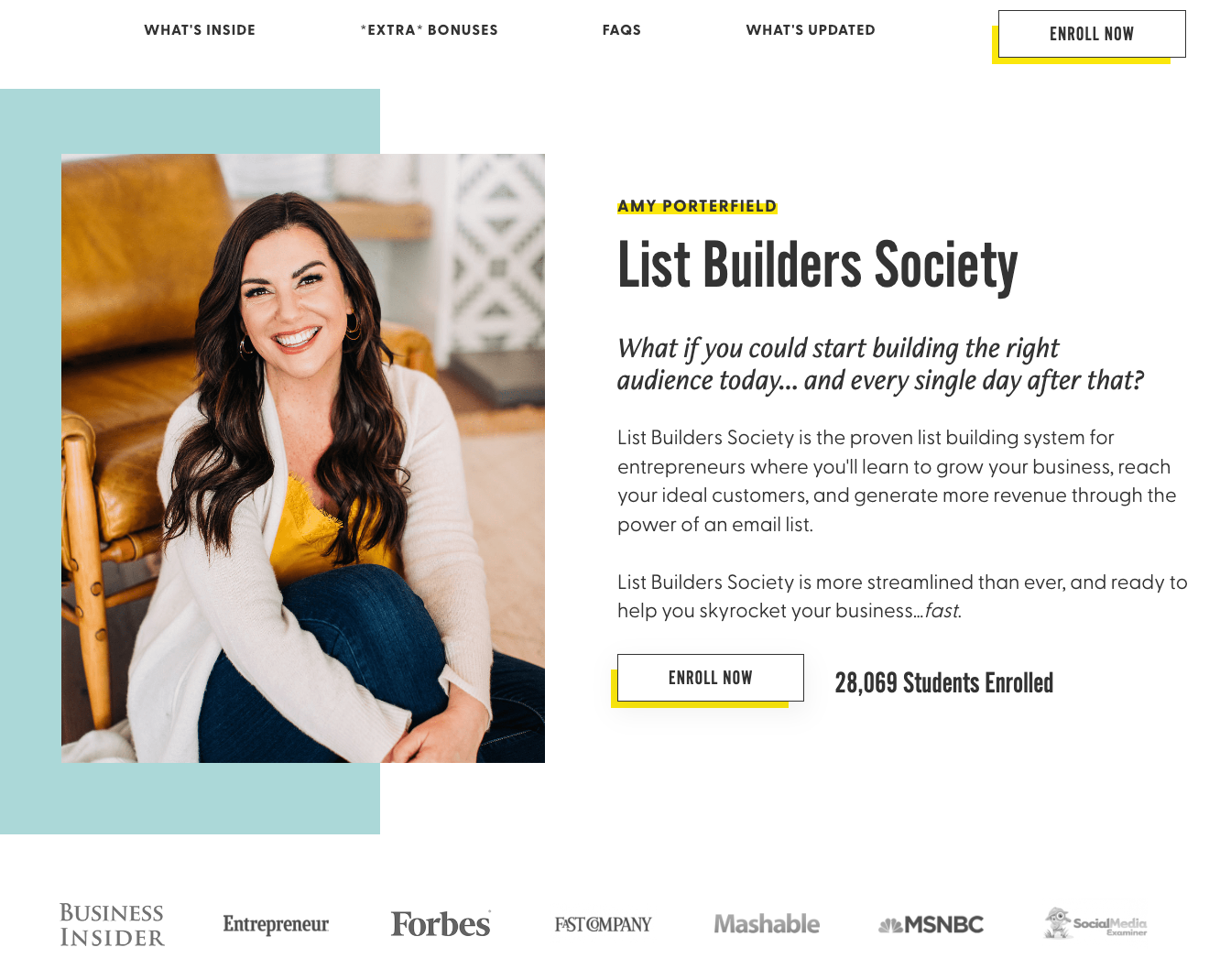
Dive into Amy Porterfield’s high-converting sales page layout and explore the secrets behind a super-effective sales page conversion strategy. Amy has a defined offer page layout, and I am a big fan.
Easy on-page navigation at the top.
Very prominent Enrol Now button in the header.
Image to the left. Headline, Subhead, and hero body to the right.
But what I really love and you should check out today is a widget in the middle of the offer page:
Look for the section: Calculate How Long It Will Take To See Your Subscribers Tick Up
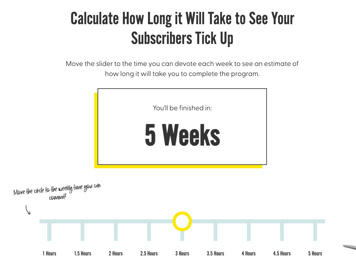
Depending on how many hours you can dedicate a week you can move the slider.
As you do the “You’ll be finished in” time changes.
As well as being a really cool web app. This is a very powerful psychological mechanism.
It puts the power and results of the program in the hands of the user.
The question is no longer will I get a result from this program.
The result is guaranteed. The only variable is the amount of time I put into it.
It also tells me that I can take the program in my own time.
This is especially important as we approach Christmas.
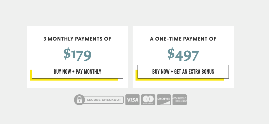
I also love how Amy has worded her payment plan:
- Buy Now + Pay Monthly
- Buy Now + Get An Extra Bonus
This is likely to save her lots of time and energy dealing with refund requests or payment plan stoppage requests and will increase her sales page conversion rate.

